In This Article
After watching countless A/B tests run their course, some performing well while others, well - let us call it a learning experience; thus, after over a decade of watching eCommerce conversion optimization trends, we have realized it is not a game of keeping up with the trends but rather understanding human behavior.
It's not the trends that make the most noise that affect sales; it's trends that bolster consumer confidence to click Buy Now.
We’ve tried to distill our most important CRO insights in the article below.
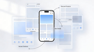
PDP That Converts
So here's a pretty painful fact for you:
Nearly half of the top-grossing eCommerce sites out there continue to have pretty average product detail pages. And we say this not to throw stones - we are guilty of building more than our share of mediocre PDPs - but because it represents a massive opportunity.
The biggest mistakes we saw?
Horizontal tabs hide information. The same old same old - Description, Shipping, and Reviews tabbed away in tiny, unused compartments most users never click on. We think users will click all the buttons we designed into our elaborate pages.
But they won't.
They're shopping between meetings, waiting for their coffee, and sometimes - pretending to listen during a Zoom call.
Instead, one long, scrolling page with a clear visual hierarchy performs way better.
Head your hero image centre-stage, price & add to cart button within thumb reach (because whether you like it or not, almost 70-80% of your traffic is mobile), and allow scroll through the rest of things organically.
Imagine rolling out a red carpet instead of rolling out a maze.
Another fashion brand we partnered with experienced a 25% increase in conversions just by streamlining its PDP structure.
Not AI, not some personalisation - just smarter information architecture and respecting how people shop.
The Sticky ATC Button: Your New Friend
We've even been doubtful of sticky add to cart buttons when they first showed up.
It felt a bit... pushy?
Almost like following someone around an actual store and asking, "Are you ready to make a purchase yet? How about now? Now?"
And then time humbled us. For a properly implemented sticky ATC, conversions can increase upto 7% - 20%, brand to brand. That's not a rounding error; that's a good quarter versus a great quarter.
The keyword is "properly."
A sticky Add to Cart shouldn't feel like a persistent pop-up ad. The best implementations activate only after users scroll past the original button, and include essential context such as price and variants.
The one thing we learnt: Test everything.
Desktop and mobile perform differently. What works for fashion might annoy electronics shoppers. The only truth is your own data.
Trust Signals: The Unsexy Conversion Driver
Trust badges and security signals are perhaps the least interesting topic in eCommerce UI/UX design.
We have had clients balk at the addition of trust badges because they are concerned that it clutters their minimal designs.
And, we get it. But you know what is worse than a bunch of security badges?
An abandoned cart.
The Goldilocks Range: 2-3 Badges max by your checkout and add to cart buttons, SSL certifications, Approved Payment methods, and, if you have one, then possibly a money-back guarantee itself.
Don't go overboard and create a badge graveyard - that's the opposite of the effect you want - but recognize that people are about to enter their credit card information into a website. Make them feel sure about it.
Shipping Transparency: The Cart Abandonment Killer
Here's a statistic that still makes us wince: 48% of people abandon their carts because of unexpected shipping costs.
No, that isn't a UX problem; that's a transparency problem we've been hazing ourselves with over and over.
The best practice:
Display shipping cost and delivery dates as early as possible, preferably directly on the product page.
Yes, it's technical.
Of course, this also means that you will need to connect with shipping APIs. But yes, it's worth it.
When delivered with clarity, free shipping thresholds do an amazing job. Free Shipping Over $49 - The copy here is crisp and clear. This also encourages customers to add more items to reach the minimum threshold amount, likely boosting average order value by 10-20%.
But to conceal this info until checkout? That is just asking people to do Math that they did not sign up for.
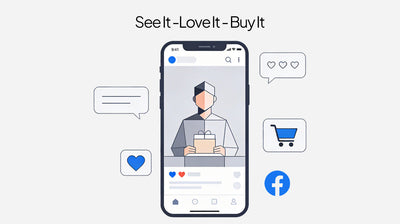
The Social Proof Revolution
The most effective pattern: Social Proofs.
Whether you call it customer reviews, user-generated content (UGC), testimonials, or anything else, it is one of the best conversion strategies out there.
People are more likely to buy products with reviews. Video testimonials generate more conversions than text.
The psychology behind it is pretty simple: People trust other people more than they trust brands.
Sorry, marketing team. This is not personal.
People are surprised that you don't need to be 5-star perfect. Perfect scores are often less convincing than products with 4.2 ratings.
In fact, they often convert better. A handful of honest feedback actually builds more trust than ongoing perfection, which ends up looking fake.
Again, the implementation matters. Reviews that are hidden at the bottom of the page are non-existent. You need those star ratings to be visible to a shopper above the fold, right next to your product images and pricing. Customer photos need to go straight into your image gallery - after all, 72% of shoppers trust photos taken by real customers over professional photography.
The Mobile Reality Check
All of these patterns we articulated require a mobile-first lens since anywhere between 70-80% of your traffic is mobile.
Sticky ATC?
Vital for mobile, where scrolling back up is a nightmare.
Trust badges?
They should be the size of a thumb.
Trust us: If you think of mobile as just "desktop but smaller," then you're leaving revenue on the table, the hard way. Mobile shoppers have a different context, a differing level of patience, and most certainly different thumbs.
The Humble Truth
Here at Seventh Triangle, after years of experimentation and iteration, and a few humblings by results we couldn’t predict, we have learned for sure that there are no silver bullets, just silver bullet patterns.
Just because something works for your competitor doesn't mean it will also work for you. Things that worked in one quarter may not work in the next quarter.
Incorporating these established patterns alongside testing them on your real audience makes the winning strategy.
And perhaps that is the true refrain: Never lose sight of the quest, never get ahead of the data, and let them teach you something new every day.