In This Article
Do you recall when the homepage was the key focus of brands?
They spent considerable time perfecting it to appear like an actual shopfront, attempting to leave their first-time visitors wanting to return or become customers based on their initial experience and the number of clicks they made by them.
As digital behaviour continues to evolve, it has become apparent that the homepage does not provide what brands thought it once did in terms of providing an all-important, central hub or resource for brands today.
In fact, the real action (and ultimately a deeper level of connection) takes place between multiple nodes and ultimately throughout, across deeper and smarter user experiences.
What Changed? The Journey Is No Longer Linear
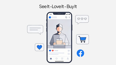
Users are not coming to your homepage anymore and reading it from top to bottom in order to go through a well-defined funnel, but instead they're coming through unexpected paths and using search engines, social media, e-mail links and targeted advertising.
Sometimes, users may never see your homepage, but instead they might see a series of micro-moments, landing pages, product cards, chat widgets, and personalised recommendations before reaching you.
The Rise of Context-Driven Entry Points
Usability in today’s digital world has placed power in the hands of the user who is acting (product listing pages, help centre articles, shopping carts, pricing tables, and even blog content ) – these are often the first things we see.
Sticky navigation, mobile menus, and dynamic cards guide users with subtle prompts rather than giant banners.
Personalisation tools help customise each user’s experience, and will often show the user relevant products and/or offers and content based on how they have behaved in the past (including location).
Visual and Content Hierarchy: Designing for Scanning, Not Staring
Today’s sites use bold headlines, cards, and icons to make scanning easy. Hierarchies are set by contrast, position, and motion. Only the essential info is shown upfront, with deeper layers available for those who want more. Asymmetrical grids, organic shapes, and micro-interactions gently guide users, making the experience less overwhelming and more intuitive.
Landing Pages and Micro-Experiences: The True Conversion Drivers
-
Campaign-specific landing pages are more effective than the homepage in conversion, engagement, and ease of understanding.
-
Using pop-ups, chats, and videos can answer questions and resolve issues for visitors, and the homepage is not involved in the process.
-
Using sticky headers, which can be minimised to showcase essential information, can prevent visitors from scrolling and losing focus.
Mobile First, Thumb-Friendly Always
A majority of site visitors are now mobile users. Thumb-oriented navigation, floating call-to-actions, and finger-friendly cards do the real heavy lifting. This means homepages must play nicely with mobile hierarchy, often serving as a quick brand anchor rather than an information headquarters.
The New UX Hierarchy: Layers of Value
Think of website UX as layered, not linear:
-
Immediate value: What can I do right now? Buy, book, chat, learn.
-
Secondary value: What solves my next problem? Detailed guides, contextual help, and up-sells.
-
Background value: Who are you? Brand story, values, social proof.
Each element should surface at the right moment, not all at once.
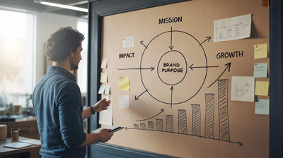
What It Means for Brands Today
-
Prioritise high-impact entry points: Make landing page, product page, help desk, and nav bar optimisation a priority over hero banner optimisation.
-
Design for real user journeys, not just our website structure.
-
Use hierarchy: Lead with the things that matter most, and still leave room for discovery for those who want it.
-
Rethink measurement: Consider looking for engagement and conversion metrics beyond the homepage, focusing on moments that drive action and loyalty.
-
Make everything mobile-ready, finger-friendly, and accessible at every level.
This new hierarchy is not about reorganising elements on the home page. It is about creating intentional UI/UX Creative that influences the way users view, interact with, and navigate through the different levels. This is where experienced UI/UX design teams like Seventh Triangle come in, not only to change the looks but also the way users experience the new hierarchy, creating conversion-based layered experiences irrespective of the entry points.
Final Thought
Your home page still serves a purpose, which is to be your handshake and your brand promise. But the hero of the conversion, retention, and memorable experience is the seamless, layered journey that users go through on your site. UX hierarchy today rewards the brands that put the customer first, no matter where they enter.