In This Article
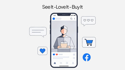
Every online store has it. The tiny button that takes casual browsing and turns it into real business. The ‘Add to Cart’ Moment Is the New Call of Online Shopping. It’s not only a step in the buying process. It’s the behavioral intersection where design, psychology and commerce meet in hushed competition.
Why do some shoppers click through the purchase process so confidently, while others waver or even drop out of the page altogether? The secret lies in often subtle, but powerful design decisions that shape how we feel, think and act.
Why Add-to-Cart is a Bigger Deal Than You Realize
If you’re running an e-commerce brand, your add-to-cart rate is your silent performance review. It reveals whether your product pages are motivating an action or turning off attention.
According to industry data, majority of e-commerce stores can convert only up to 8-12% of the visitors on product pages into cart-related actions. For a smart and mature business, here there can often be the least amount of lift for the greatest amount of gain in sales and retention.
Why People Really Click
At the exact moment of consideration, these shoppers are unconsciously balancing two invisible scales: trust and desire.
Does this website feel credible? Is this clean product right for me? Does it seem like an easy step, or a risky one?
The most successful user-experience design eliminates hesitations, builds trust and delivers tiny moments of delight that make action feel so instinctive.
Design Decisions That Drive Action
-
Make It Obvious and Inviting
Your button should contrast in colour and placement. It should be big enough to see on a mobile device and situated near important information such as the product image, price and major details.
-
Show Social Proof
Star ratings, favorable reviews, “bestseller” labels or “X sold this week” badges help because they encourage people to think: Others have made the same choice and haven’t regretted it.
-
Highlight Scarcity or Urgency
When items are selling quickly, small inducements to action - “Only five left,” “Sale ends soon” , provide the kick that gives buyers a rationale not to hesitate.
-
Use Clear Copy
Words like, “Add to Cart” or “Buy Now” are better than something overly creative. Offer reassurance directly beneath the button, saying, “Free returns” or “Secure checkout,” to allay any last-minute doubts.
-
Encourage Personalization
Enabling shoppers to select the color, sizing, or add a personalized note further drives emotional investment in the piece and therefore increase their likelihood of purchasing.
-
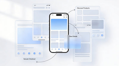
Make Progress Effortless
Reduce unnecessary steps. No pop-ups or distractions to disrupt the experience. The easier the trip, the more likely visitors are to convert.
Psychological Triggers Behind the Button
-
Reciprocity: Offering free shipping or an initial discount engenders goodwill and encourages people to take action.
-
Commitment Bias: When someone pushes “Add to Cart,” even out of curiosity, they are more likely to go through with a purchase.
-
Anchoring: Displaying a higher crossed-out price next to the discounted one makes it feel like more of a deal.
-
Loss Aversion: Reminding people that a deal is about to expire or that supplies are limited encourages them to act before it’s too late.
The Role of Microcopy and Visuals Factor
Every now and then, a few words can trump a massive overhaul. Microcopy like “Selling Fast” or “Almost Gone,” positioned around the button, can psychologically trigger urgency.
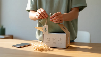
Pictures are also very important. Spreading mental imagery that actually demonstrates a product in use is effective at reducing these doubts and making the purchase seem less risky.
Data-Backed Impact
Brands that are always improving on the add-to-cart experience enjoy long-term growth in both conversions and repeat purchases. Clever placement, true trust signals and valuable suggestions (“People also bought…”) keep the momentum going even beyond the first click.
Implications for Brands and Marketers
Intercept shoppers where they are in the purchase mindset.
Please maintain the consistency of a minimalistic, very clear design.
Leverage social proof and micro incentives to create trust.
Test, measure and refine button copy and placement to see what resonates.
Final Thought
The “Add to Cart” button is much more than a mere functionality. It’s the gap between curiosity and full-on commitment. The best brands are designed with empathy, URA and strategy.
Because really in the end, that little button is about more than just sales.” It comes down to trust and forging long-term relationships, not just getting the first buy.